This year, Honeycomb Group customers were instrumental in the redevelopment of our Group website. Their feedback has enabled a seamless web experience and provided easy access to support for individuals seeking affordable housing, assistance with domestic abuse, homelessness, or general home support. Here’s a look at our journey…
Where it all began
Our journey towards a new website started exactly where everything should – with customer feedback. In late 2023, we added a permanent survey on our individual brand websites to gather this data. For us, it was absolutely vital that we consulted with those who use the services of each brand before procuring a new site. They know us and our services best, so they had to be at the heart of such a big and exciting change.
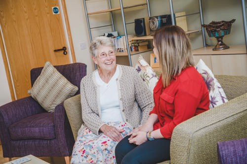
The biggest piece of feedback was that the customer journey was longer than it needed to be. Some of our customers need to access the right info and support quickly, so we took this onboard and have aimed for a three click maximum journey to support. This means one to two clicks to find with urgent support for our domestic abuse customers. We also added a quick exit on every single page to improve safety when accessing the Honeycomb Group website.
Another piece of feedback was that customers felt like we weren’t telling our story – particularly the connection between our incredible brands – as well as we could have been. We had similar responses from colleagues, partners and stakeholders, so we knew we had to change our digital presence and make the move to a ‘one family’ website.
This unique digital style now reflects our brand architecture with Honeycomb Group as our family brand which enables our support brands (Staffs Housing, Revival, Glow and Concrete) to continue to deliver services and fantastic outcomes for local people.
The process
We procured our developer and set about designing each page, piece of content and image with the above customer feedback in mind.
We implemented key priorities that were raised such as accessibility, creating a clear and easy customer journey and most importantly, visitors being able to access help as soon as possible. As mentioned above, this was particularly important for customers of Glow, our domestic abuse support service, who may be living in dangerous situations.
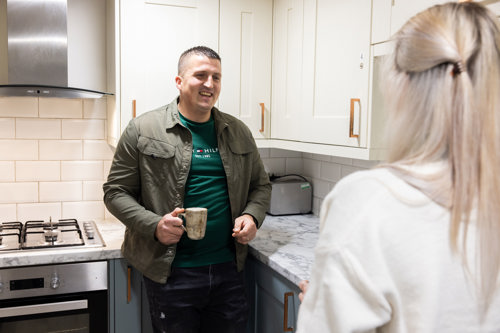
Towards the end of the development journey, we encouraged our customers to influence the website even further and evaluate our work so far. We held sessions with customers from all brands, inviting them to share their feedback and, most importantly, test the sites themselves. We listened to them closely and made further changes, to ensure we were designing a digital platform that truly meets their needs, and the needs of potential future customers too.
Our new website is not just about improving access to information – it’s about ensuring that those needing our support can reach out for help quickly and easily. We know that every interaction matters, especially in times of crisis, and this website is a crucial part of our mission to be there for people when they need us most.

The future
For us, this is only the beginning of an exciting digital transformation project we’re working on, not just for our customers, but in collaboration with them.
To continue gathering feedback, we maintain a strong colleague presence across our schemes and services.
Customer engagement is always our top priority, but it will continue to be a real focus over the next six months as we roll out the new website and make sure it works for them – making continuous improvements along the way.
Our next step will be the transformation of our current customer portal, to make sure this is accessible for all of our customers across the Group, yet again reinforcing our one group approach, and creating a digital presence which encapsulates all of our brands in one easy place.

